Fresh Roasted Coffee Responsive Website

My role: Lead designer, research, mockups
Overview
The user: Customers of Fresh Roasted Coffee, an eCommerce company that sells made-to-order coffee, tea, and botanicals online. Customers are typically in their 40s-50s. The site is primarily accessed on mobile, but most purchases are completed on desktop.
The problem: Fresh Roasted Coffee’s website had not been updated since 2012. I was asked to make the UI more contemporary with “lots of colors.” Prior to my involvement in the project, a Shopify theme had already been purchased. Stakeholders did not want to deviate from that plan. After bringing myself up to speed, I realized the Shopify theme that had been purchased lacked consistent user experience as well as more than a few accessibility violations. I brought these to the attention of the stakeholders, explaining the importance of meeting accessibility requirements as well as the benefits of improving the overall user experience of the site rather than a mere palette swap. They agreed.
The solution: A comprehensive redesign that was more than skin deep.
Accessibility Considerations
I take accessibility very seriously, and so I designed with that at the forefront of my mind, not even using a single color before manually checking it for contrast, as well as other accessibility best practices. We also used the WAVE tool by WebAIM to double check everything prior to launch.
Getting to the root of the problem
I approached this project from a desktop first/graceful degradation approach because analytics indicated most users were completing the checkout process on desktop computers. I observed heat maps and session replay software. I also asked questions of the Fresh Roasted Coffee customer service team, and they helpfully provided common user problems that resulted in phone calls from customers.
The major problems were:
- The homepage had an overabundance of content, which made it harder for users to find what they were looking for.
- Fresh Roasted Coffee actually consists of three brands: Fresh Roasted Coffee, and two sister brands: Positively Tea and Positively Botanicals. The shopping experience and navigation for tea and botanicals was unintuitive and clunky.
- The site needed a more robust account page section to manage loyalty program points, subscriptions, and other features. Furthermore, users would often miss out on loyalty points because the interface lacked a clear indication whether a user was currently logged in or not.
Solutions
I proposed solutions to stakeholders for each problem. Some were immediately accepted, and others required collaboration and multiple iterations.
Problem 1: The Homepage:
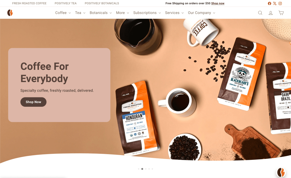
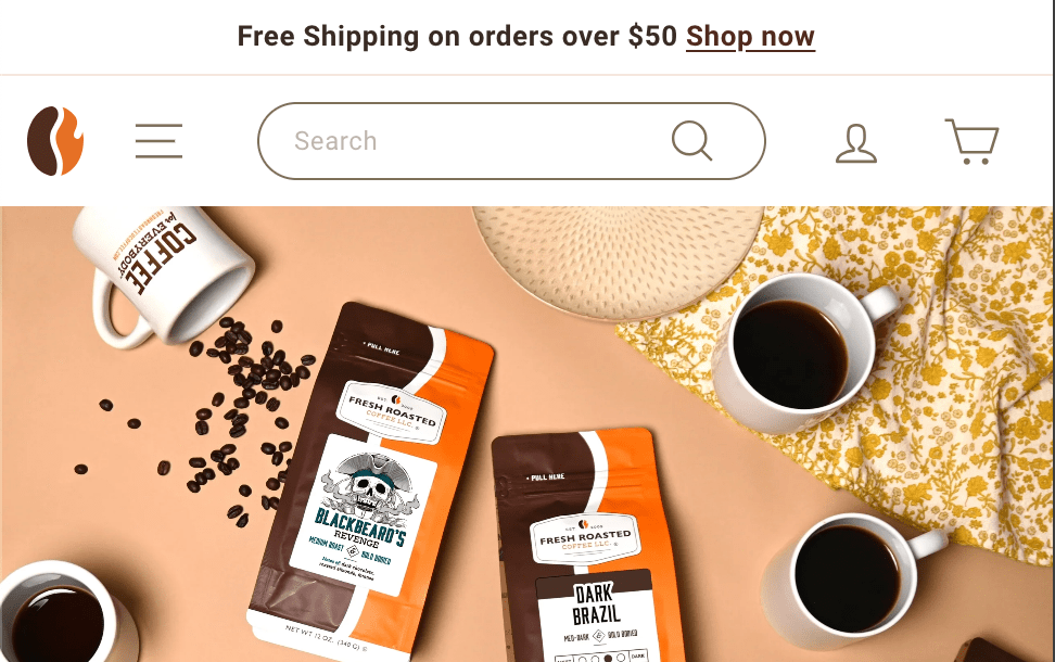
The original homepage provided access points to every style of product sold on the site, and I was able to observe most of those points were largely ignored, but still slowed users down as they had to stop to scan and consider options. I simplified this by whittling down the from nine choices to only three by making it a section for Best Sellers, while relocating the less popular options under headings in the top menu.
Before:
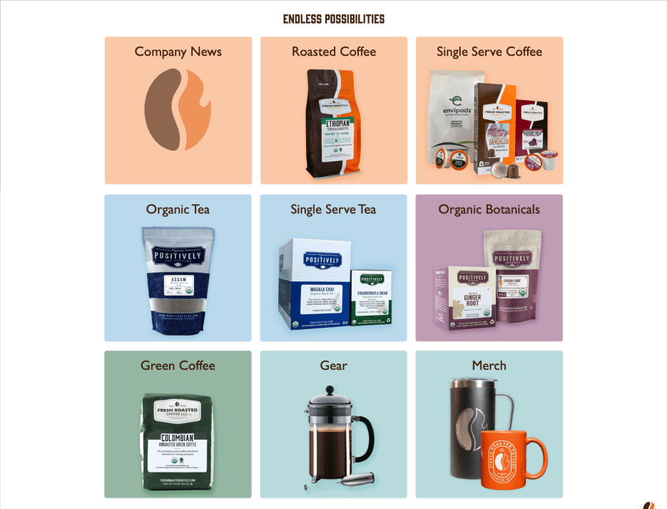
And after:
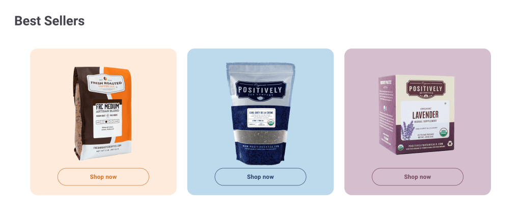
In addition to reducing the staggering number of choices, the site now used color to both provide intuitive navigation clues and reinforce company branding. Win-win!
Homepage prototype:
This is a short clip of the prototype I created in Figma.

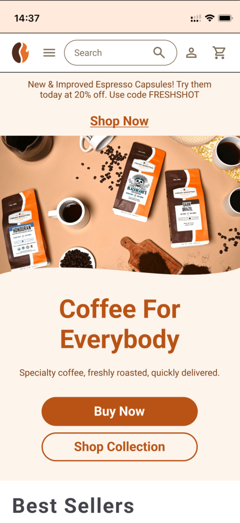
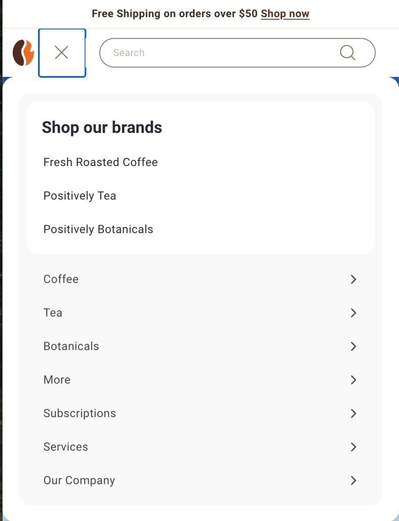
I also created a mockup and prototype for the mobile version of the homepage in Figma:

Problem 2: Navigating Between Brands
Fresh Roasted Coffee is actually three brands: Fresh Roasted Coffee, Positively Tea, and Positively Botanicals. On the original website, navigating while shopping exclusively tea for tea or botanicals was unintuitive and frustrating because of some uncommon user patterns.
For example, if the user shopped for tea, the logo at the top left would change to the Positively Tea logo, like this:

The problem was that if a user wanted to return to the homepage for tea or botanicals, clicking the logo in the upper left, a common user pattern, would return them to the homepage for Fresh Roasted Coffee against expectations. This created user frustration and a desire to have all brands navigate in the same way.
We found through user testing that having the Positively Tea or Positively Botanicals logo return users to the landing page for those brands was not ideal either. This made returning to the homepage for Fresh Roasted Coffee a source of confusion. A different solution was needed.
The team collaborated and devised another solution: a brand tab feature. Each brand had a position in the top menu, as a higher tier of navigation. The active brand was depicted in bold font and its brand color, which left the Fresh Roasted Coffee favicon free to be a link to return to the homepage. User testing indicated this was the solution the team had been looking for.

Fresh Roasted Coffee

Positively Tea

Positively Botanicals.
What about mobile? Making these selections on a small screen sounds positively infuriating, doesn’t it? On mobile, all menu items are collected beneath one hamburger menu, so I also positioned the brand selections under the same menu, with clear wording, of course.
Problem 3: A More Robust Accounts Page
One of the common complaints the customer support team received was pertaining to the accounts page. It lacked many features, including the ability to manage coffee subscriptions, easily check loyalty program points. Stakeholders also wanted to increase revenue by including a single click reorder button from the homepage that appeared when the profile button was clicked. I cautioned against this move, because it established an uncommon user pattern and made assumptions about how users wanted to use the site that weren’t backed up by data. By enabling single click reordering from the homepage, they were establishing an uncommon user pattern and also adding additional clicks to any interaction that wasn’t a quick reorder. I informed them I could use a more widely adopted user pattern to accomplish their desired quick reorder in the same number of clicks, and they agreed to the plan.
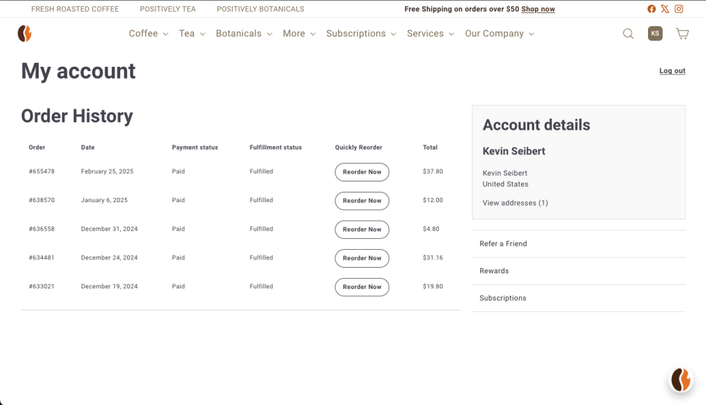
In this redesigned account page, the order history and quick reorder button is present immediately, but the other functions of the accounts page are in plain sight and a single click away.
An additional problem users had with the original account page was that it was unclear whether or not they were logged in, and users were often calling customer support to complain that loyalty program points had not been applied from recent orders. This was a frustrating experience for them, and required unnecessary bandwidth from customer support. After research, I decided to swap icons in the toolbar when a user was logged in to make it more clear.
A typical profile icon when the user is logged out.

The first two initials provided in the user’s account appear to indicate when a user is logged in.
The New and Improved Product Pages
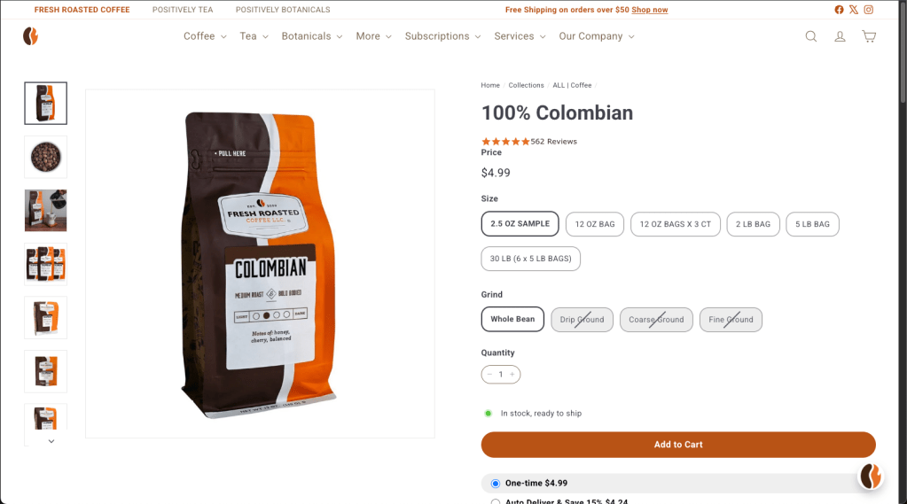
The original product pages for Fresh Roasted Coffee had numerous problems. Information provided by customer support indicated that selections for weight and grind were being overlooked entirely by customers because they were under dropdown menus. Additionally, dropdown menus are less friendly on a mobile touchscreen. I developed mockups in Figma to solve this problem:

The mockups provided clear indication of the available formats, with inactive states shown for formats offered in other coffee products, but not for the currently viewed product.
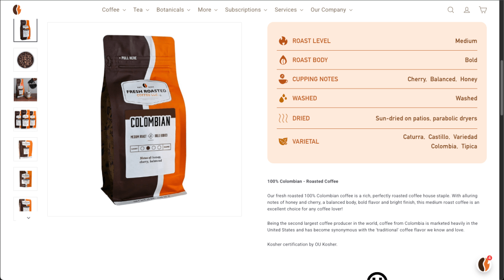
An additional problem the old site had was it required far too much scrolling to access basic information, increasing interaction cost and the likelihood of the user abandoning the process. Information such as roast level, body, process, and varietal were scattered throughout the page and spaced far apart. I created a table component with custom drawn icons to keep all of that information in one location for easy access. I provided separate styles for coffee, tea, and botanicals. This table is an example for tea:

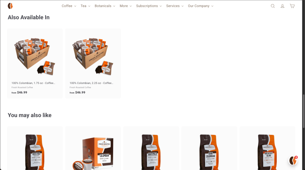
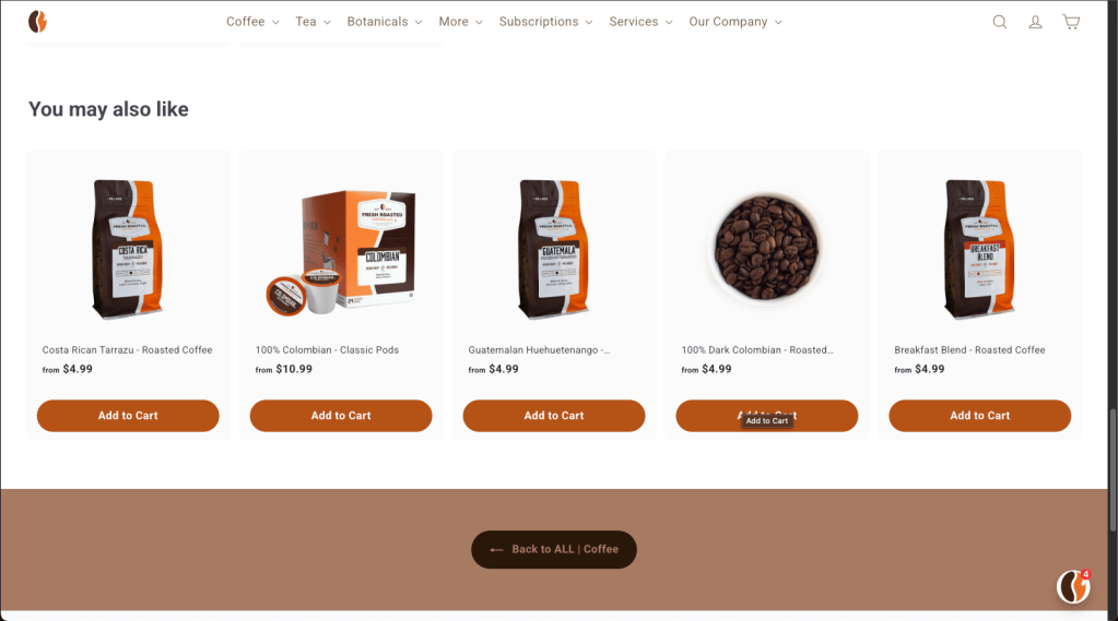
Stakeholders also requested a recommended product section at the bottom of the page, so I also added that feature.
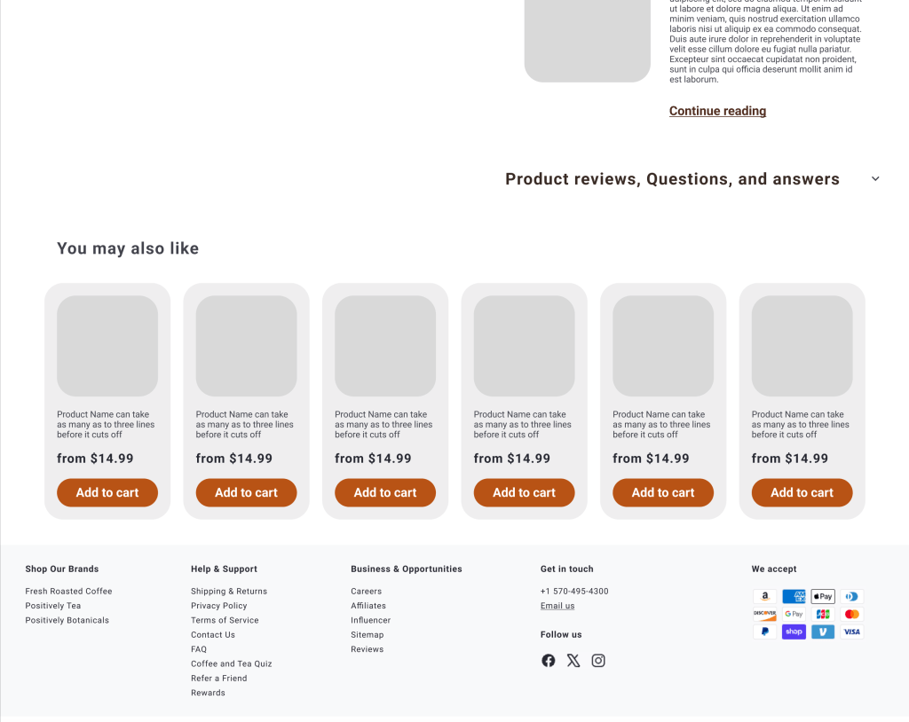
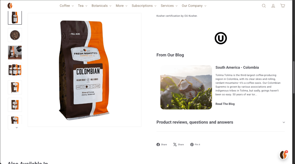
Here is the final released version of the product page for comparison. In the later stages of the mockups and in the final version, the product photo remains fixed in place and the information in the right column scrolls, although that changes for mobile.
Improving the guest checkout experience
I’m still working on the case study for this section! Please check back soon!
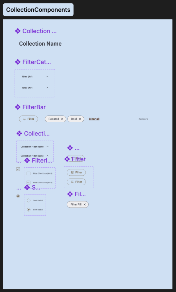
Sticker sheet
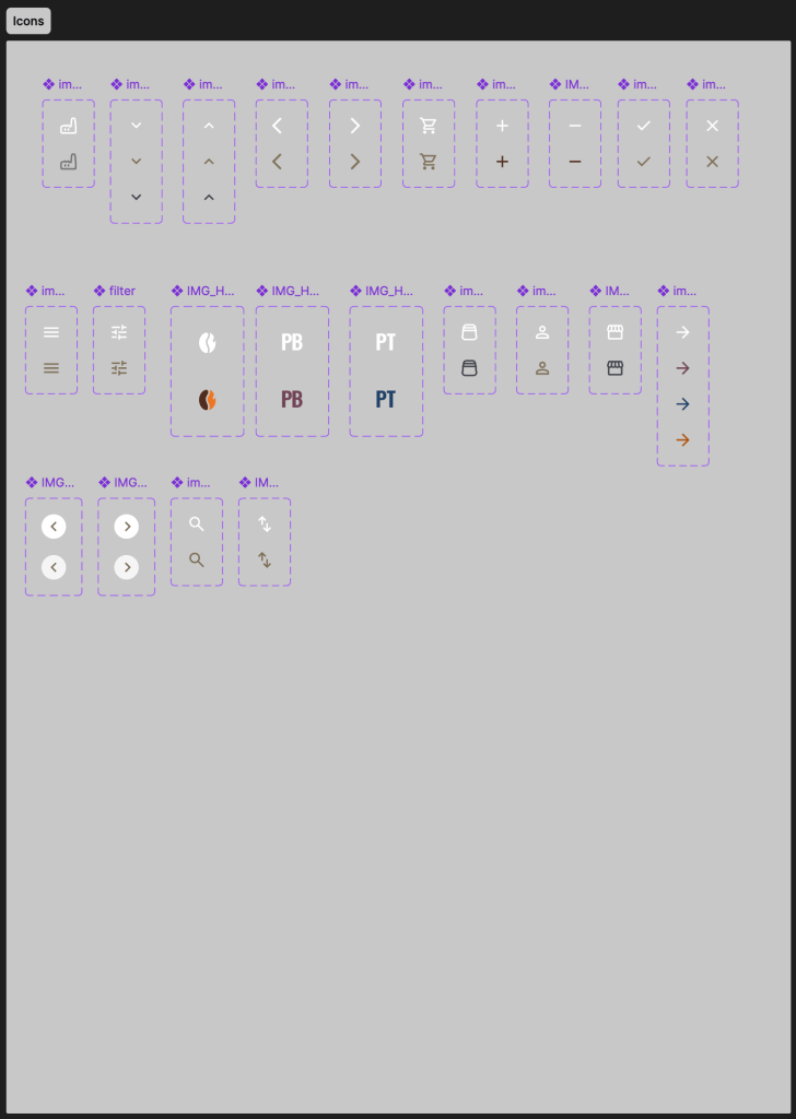
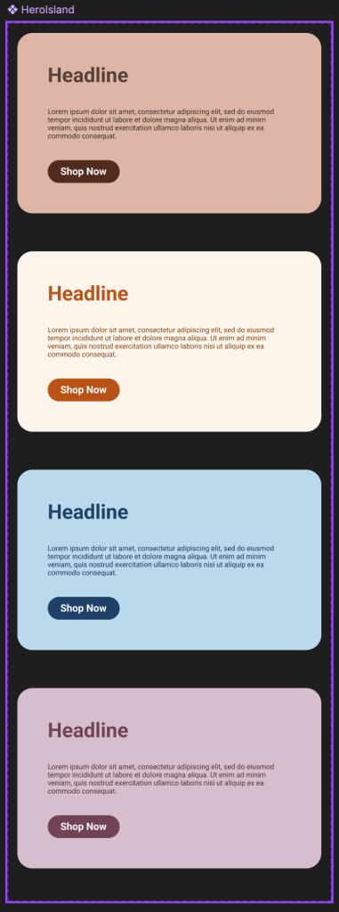
These are the reusable components I created to build the responsive site for Fresh Roasted Coffee.


Next steps
I plan to make continual improvements to Fresh Roasted Coffee’s website. There are still a few less-accessed subsections on the site that are under the old styling and had to be temporarily abandoned to meet MVP for the new site. I want to approach those with the same attention to detail and user data applied to the rest of the site thus far.
 Kevin Seibert Design