Crescent Camping Responsive Website
My role: Lead designer, research, wireframes, mockups, prototypes, usability testing
Overview
The user: People who want to shop at a local business for their camping supplies.
The problem: Crescent Camping is a small camping supply store with limited business hours. Their customers’ schedules don’t always allow them make it to the store to shop for camping supplies.
The solution: Create a mobile app that allows users to shop on their schedules and choose either in-store pick up or delivery.
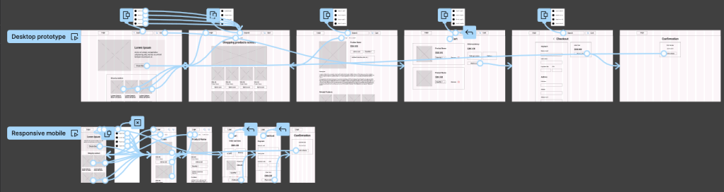
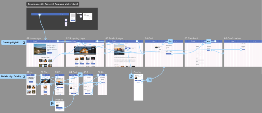
Wireframes and low-fidelity prototype
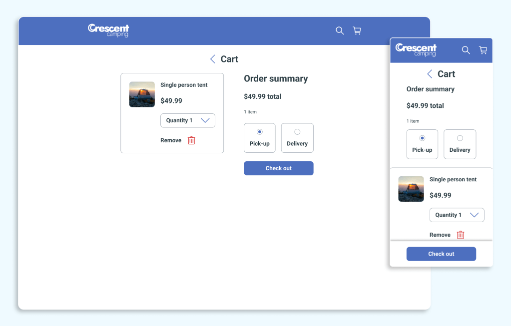
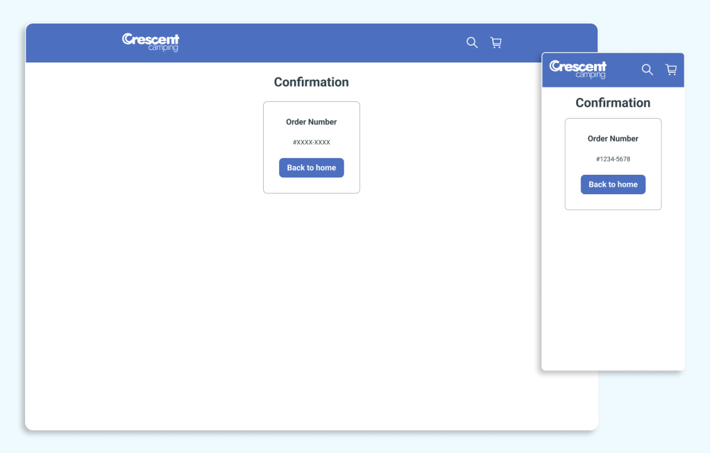
I approached this project from a mobile-first philosophy because research had indicated the majority of users were accessing Crescent Camping from mobile devices. I began by designing a mobile app. That case study can be found here. From there I moved on to creating the responsive website. I kept in mind the lessons learned from the mobile app regarding the user flow. I retained the overlay to make additional selections when the user selected “add to cart” from the search screen. I also left in the option for the user to learn more about a product on a product information screen. User testing revealed the user flow of shopping through checkout remained intuitive.
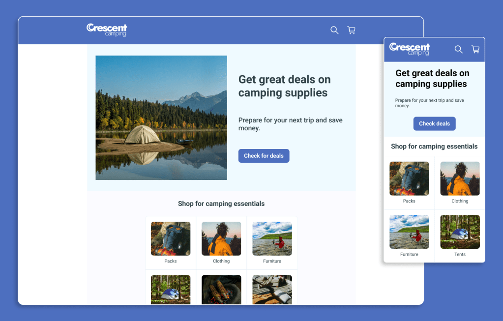
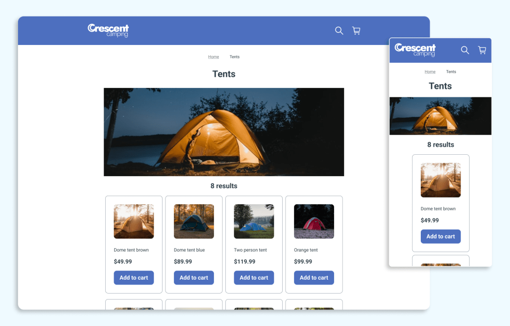
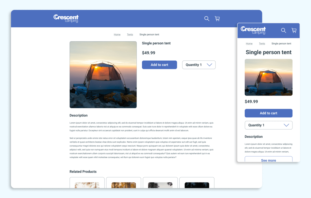
Mockups and high-fidelity prototype
After user testing, it was time to create mockups and a high fidelity prototype.


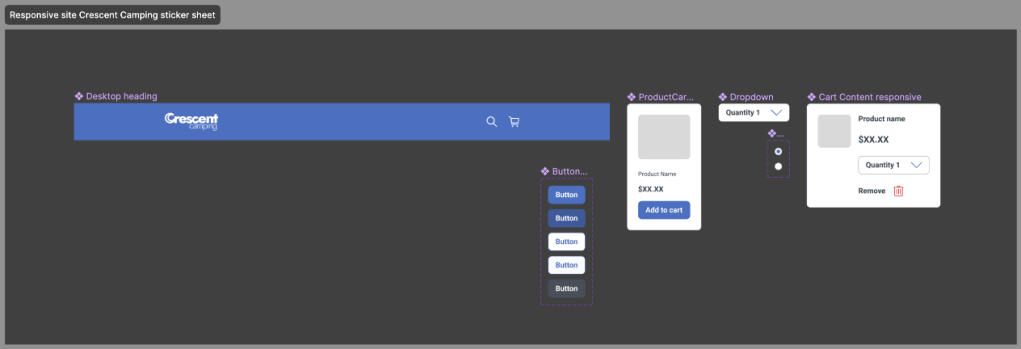
Sticker sheet
These are the reusable components I created to build responsive site.
Prototype in action
If you want to experience the prototype for yourself, please feel free.
Crescent Camping Desktop prototype
Crescent Camping Mobile prototype
Next steps
If I revisit Crescent Camping’s responsive website, I would like to add a sign in and account options to the design. During usability testing it was expressed that the ability to save information such as address, payment information, and previous orders is a feature users would like.
If you have any questions, I would welcome an opportunity to discuss this project with you.
 Kevin Seibert Design